Keen to know more
about our Full Service?
Our world class qualitative user testing can help explain the why behind your data and give you the answers to your burning questions.


 20 Aug 2016
 3 minutes read
Imagine a world where people carried out ALL of their daily activity on mobile devices? Imagine using your mobile for leisure activities like ordering and paying for meals. Or working at a company that exclusively gets work done on tablets and mobile phones? Or what about a world where everywhere you go, can be tracked by a mobile phone. Well, this isn’t some future utopia/dystopia, this is the world we live in today. We already have so many uses for mobile devices, and at the rate we are going, it’s easy to imagine a future without desktop screens at all!

Kim Posnett, who heads internet investment banking at Goldman Sachs, has said that companies are quickly trying to adapt to a world where nearly all digital media and commerce is driven by mobile devices. Consumers have their mobile devices in arms reach 90 percent of the time, and they check their phones an average of 150 times a day, say’s Kim. Mobile commerce, she adds, is already surpassing non-mobile commerce, “…we’re in the middle of a major paradigm shift in e-commerce”.
According to a recent study out of Iowa State University, even if a mobile app can’t complete transactions, it can still increase spending by increasing brand and company visibility. The study also suggests that mobile apps are often a user’s first impression of a company or service, and it’s common to immediately delete an app after downloading if that first impression is not good.
So what does this mean for your digital product or service, and how can you design for this new mobile era?
Compared to desktop users, customers on mobile devices want to complete their intended tasks quickly and efficiently, and must be able to find what they need right away, regardless of where they are. Since users these days are typically tapped into three mobile devices on average, this increases the number of touchpoints your product could potentially have with customers. In other words, your users are engaging with your products much more differently, and more often. Take these scenarios, or user stories, into account when designing your mobile product.
If you’re not providing your customers with a great mobile experience, you could be alienating a huge part of your potential market. According to Google, 67% of consumers are more likely to purchase if the mobile site experience is good, while 61% said they would leave a mobile site if they didn’t immediately find what they were looking for.
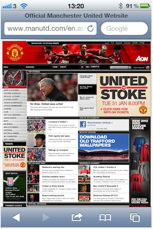
Good thing they fixed this!
It is important to take advantage of mobile-first design practices to keep your designs easy and delightful to use. It’s not necessary to completely abandon your desktop site, but focus more on your mobile app or mobile browser-based design in order to give the best mobile experience. Because mobile layouts should be more streamlined than desktop sites, you should first consider some of the most important tasks your user would want to do on your mobile site, whether that be making a purchase or reservation, or finding more information on your product. Streamlining your product’s sign-up or onboarding process by rethinking lengthy tutorials or sign-up forms is another way to optimize the mobile experience. Whatever the task may be, using a mobile device to accomplish it can be much more enjoyable and efficient.
Many popular and successful mobile apps also have clean, minimal design with iconography that has been tried and tested with users before going live. Even your use of color can also affect a user’s behavior — The Next Web notes that colors like red and green can affect conversion rates, and are often popular choices for elements like action buttons. Gesturization (like pinching, swiping, or scrolling to obtain new information) should also be used as much as possible. It’s also important to maintain your mobile presence in order to keep with current development technologies and UI trends. Nothing is worse for a consumer than a broken or outdated mobile site.
Iterating on your designs by testing your features is another way to get accurate user feedback. Making changes in small increments rather than huge overhauls could save you time, money, and actually get you more sales and conversions. Huge overhauls are riskier in general on mobile apps than on desktop sites, since it’s not possible to reverse or roll back an update that isn’t working.
It is important to know that the state of design is constantly changing in the digital world. What is considered a best practice now may be obsolete in a year, or replaced with something better. Be open to trying new things if you are able to, and you might discover a pattern or flow that you didn’t think would be successful. If you are you thinking about revamping your existing mobile design or starting a new one, TestMate’s user testing services can help you identify problem areas, differentiate your offering in the market, increase conversion rates, and ensure customer engagement.

Our world class qualitative user testing can help explain the why behind your data and give you the answers to your burning questions.


